Fulfilling my childhood dream to build a browser game
When I was a teenager and writing my very first few lines of code, I dreamed of building a multiplayer game. Back then I was using the 3D GameStudio A5 game engine. Sadly, that meant to even try multiplayer (that was supported by the engine), I would have to pay $1'250. Of course that was way outside my budget. Too bad Unity wasn't available back then.
A few years later, as I was doing lots of webdev, the idea resurfaced. Inspired by the likes of GuildWars, Morrowwind, and Diablo I set out to create my very first multiplayer browser game. I remember my first line of code was something like this:
$warrior_health = 100;Obviously, I had no clue how to go about designing a game. Making websites was easy, just copy what everyone else is doing. Of course, browser games to copy also existed, but I really didn't like those. The most popular one I can remember from that time is Ogame, but many of them were similar. Click a button to start training or building a structure. Then come back in 24 hours to build the next one. Boring! Since that wasn't the kind of game I wanted to build, the idea got lost again.
Fast forward 15 years later. We're in the middle of a pandemic and people are looking to connect online more than ever. This time I'm going to give this Idea a real chance, using all the knowledge I've gained over the past few years. This article is about that process.
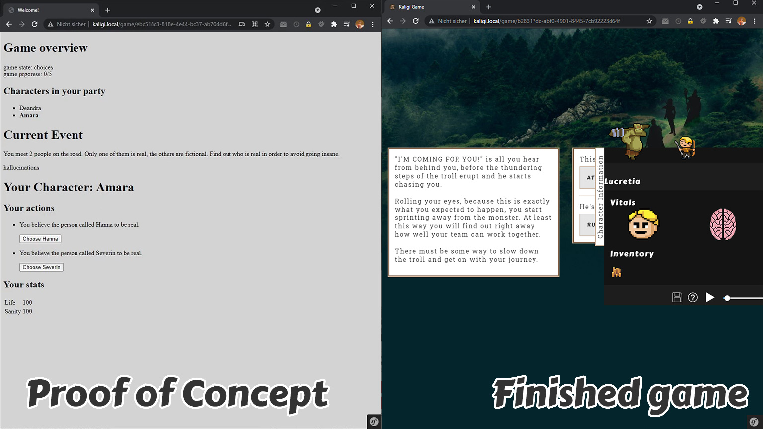
Here is a small preview:
Game Idea
What is my game going to be all about? How can we make a fun browser game? I already know that I don't want it to be a waiting game, like Cookie Clicker or Ogame are.
At the same time, I want to preserve the elements that, in my opinion, make a good browser game:
- Works well with the players full attention over an extended period of time and with intermittent attention (for example if the player temporarily loses internet connection or gets distracted).
- Can be played on any type of device (with different input methods).
- Take advantage of being able to connect to other people.
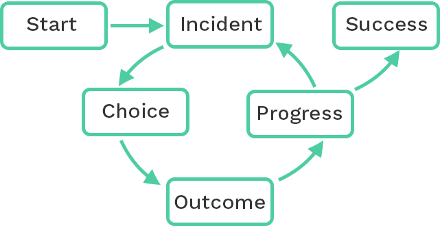
After some brainstorming, I settled on an idea. The game would be about a group of people living through some kind of challenge. I was inspired by "Secret-Role" games like Mafia, Werewolf or Secret Hitler. Combined with "Choose your own Adventure" and Adventure room type games. These games require a group of players who then experience an adventure step by step. Each round takes the group closer to a conclusion.
These are the steps that I settled on for the first iteration of a game:
Proof of Concept
With a clear idea of the kind of system I wanted to build, I set out to build a proof of concept to see if I could find the fun, as they say. Since this is a browser game, I can just use many of the technologies I'm already very familiar with from my webdev job.
Here is a video of a very early stage in development. The only thing that works in the frontend is the main way of engaging with the system: Making choices.
To demonstrate how the game could be played, all that was needed was one Incident (something that happens to the player group). The prompt is as follows:
You meet two people on the road. Only one of them is real, the others are fictional. Find out who is real in order to avoid going insane.
These are the choices each player would have:
Take a moment to see if you can figure out the answer.
... Are you sure it's already been a minute? Alright...
Severin is the only person both players can see. The other names are hallucinations. This event is the perfect example of what I imagined the game to be about. No single player has all the answers. The players must talk to each other in order to complete the challenges.
Having gotten this far, I was satisfied this was all the functionality I needed to find out if anyone could enjoy the game concept. So, I applied just a tiny bit of polish by setting a better font (Arial, huge upgrade) and adding buttons to progress the game, so I don't need to manually send API calls anymore.
With all that setup I pitched the game concept to some of my friends and asked them if they thought a game like this could be enjoyable. This is what I showed them:
They were intrigued enough that we ended up collaborating for a few weeks. Coming up with and iterating on different ideas for scenarios to add to the game.
Initial Story and UI
It quickly became clear that just making random events in a vacuum wouldn't cut it. At least not at this stage. To keep the player engaged it was necessary to have some sort of narrative. No problem, that sounds like something a game should have anyway. Here one of my friends came through again and delivered an amazing narrative in a cool universe (thanks Nathan!).
Nathan's universe was a good foundation to build the theme for each of the encounters (or chapter, as I started calling them). His story also served as good inspiration for some of the chapters we wrote.
Our process looked something like this: Once a week we would meet and play whatever version of the game was playable. Following the playtest, we would discuss anything that needed improvement and any new ideas that had come up since the last time.
During this time I also grew sick of the black and white prototype interface, so I grabbed some free assets of itch.io and put something together that resembled our theme. A fantasy world with sticks, swords, lots of raw metals and dragons to guard them.
This is what our small team of friends was working with for most of that time:
In the video above you can also see some hints to some basic mechanics like gold, health, sanity and items.
First release
Calling this version a "release" is only true in the sense that we gave other people access to the game. Nonetheless the player could experience a complete story arc, some OK puzzles and even some custom (beta) art for many of the encounters.
I pestered some of my friends to play this version while I watched. The reception was hard to judge, since most of my friends didn't want to say anything too mean. All in all the game had a lukewarm response. People cared enough to try multiple times if they failed, but not enough to play on their own or recommend the game.
Today it's easy for me to see why — many of the chapters could be solved by clicking random options, without understanding the mechanics. Thus, they often didn't understand how or why they were progressing. That is a lesson that I burned into my mind for the second story. But more on that later.
The state of the game during that time was almost the same as during development, except that the story had a lot more words and I upgraded the UI a little with some more free assets.
Having spent about four months working on this game in my free time I was ready for a break. That would have been all she said for this game, had I not tried one more thing to get some attention for our concept. I posted the game on /r/WebGames because why not.
In fact I posted twice over a span of six months and each time something incredible happened. Over two weeks, people kept coming back to play the game.
While the game wasn't a breakout success, people did at least find the idea intriguing enough to come back and give it a try. It's important to note here that people need to find a group to play with before they can start. That usually incurs a few days delay between the initial visit and starting a game.
Chapter 2
Inspired by the fact that people seemed to find the game concept interesting I decided to make a second major iteration. This time around I had more time to invest than the first time. What inspired me was the amazing opportunity to create something other people might enjoy playing. My job often involves creating things few people really care about, so the idea of creating something others might think of as good entertainment was and is enthralling.
The goals I set for myself for the second iteration were twofold:
- Create about two hours of content focused on puzzles.
- Revamp the UI to make it responsive and more focused on gameplay elements.
There won't be many specifics about the content in this article, because that's beside the point. It's about the process to create the new chapters. In general, it involved more of what we did for the first story:
- Brainstorm an interesting chapter / puzzle
- Implement a "shitty draft" of that puzzle
- Pester friends to play and see if it's fun
- Iterate on the idea
Each chapter had to follow the lessons learned from the first release. These are things I watched people struggle with in playtesting and that dawned on me after a few months hiatus.
- Each choice must mean something. There must be a valid reason to use each possible choice. The player is not always aware of that purpose from the outset.
- Every player must always have individual (different) choices, even if that is only in text. Otherwise players don't feel like they're independent.
- The players start united. Give opportunities to force the group apart and betray each other (or hide things). This is to prevent the group of simply listing off all possible actions to each other.
UI Revamp
Previously there was no mobile version, despite that being one of my criteria for a good browser game. Also, I didn't like that the old UI was not focused on the gameplay. The meat of the game — the choices — are tucked away at the bottom left of the screen. Elements like progress and health overshadow the prompt to the questions in their screen presence.
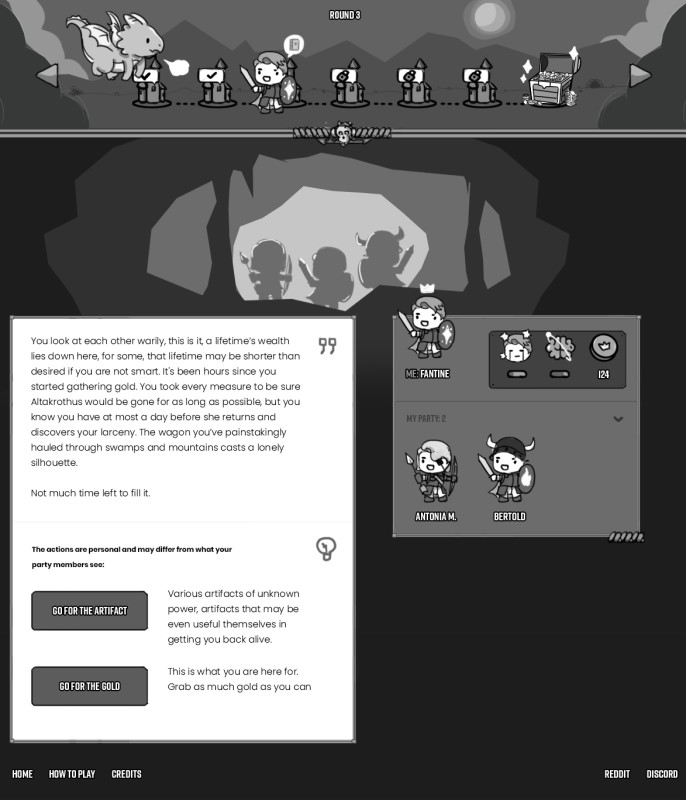
To solve these issues, and get an original style going, I contacted someone on fiverr to rework the interface. I sent the person the link to the current game, annotated screenshots, and my thoughts on what I wanted changed. We agreed on doing a wireframe to start off. This was the result of that transaction:
My first reaction was that I loved the cave art at the center. The second reaction was that this just looked like the old UI, but with prettier graphics. While it was a value add in total, this was neither what I expected from a wireframe (what we agreed on) nor was it a graphical design (as it's black and white).
As this is not my first rodeo when it comes to working with freelancers, I know that getting to know each other's skills and expectations is a big part of forming a good working relationship. Creating that bond takes time and since I'm footing the bill out of my own pocket, I decided not to invest too much into the project financially.
For that reason, I set out to redesign the UI on my own. Not something I enjoy doing. I just hope the result will be sufficient. The first step was to wireframe (according to my understanding of that term) how the layout should look like on mobile and desktop using draw.io.
Mobile Wireframes
Desktop Wireframes
With these wireframes I, again, gathered feedback from my circle of friends. Many of them luckily have experience in media or web creation. Because of their positive feedback (and lack of negative opinions) I believe my goal of the interface being OK was met. I like the focus on gameplay elements much better in this version. Today I'm not sure if that focus came at the cost of some of the theme though.
Before taking what I had and adding it to the game, I wanted to make sure that I had the responsive behavior locked down. Additionally, I needed to see the result of the wireframes in the browser. To achieve those objectives I built a throwaway HTML prototype. Unlike what you might be used to, I actually did throw it away after fulfilling its purpose.
Prototype UI and final product
The prototype helped make a few more iterations on the layout and eventually I implemented the updated UI in the game. Check out this video to see the prototype and the eventual implementation in the browser.
Things I failed at
Now for the fun part. Everything that I failed at.
Art
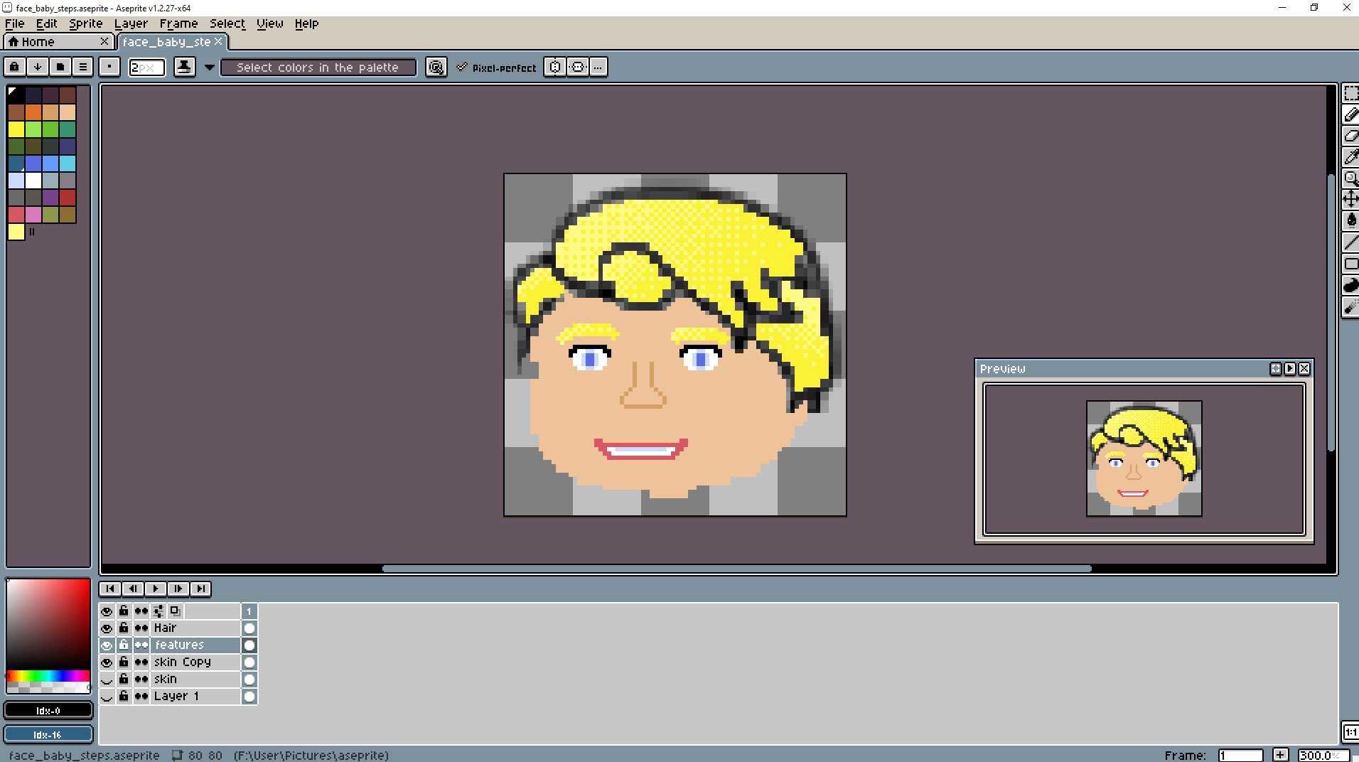
First, I would like to share with you this masterpiece:
Isn't he pretty? Needless to say, I am no artist. That was the first and last piece of art I tried to make for the game. I found other people to do those.
Landing pages
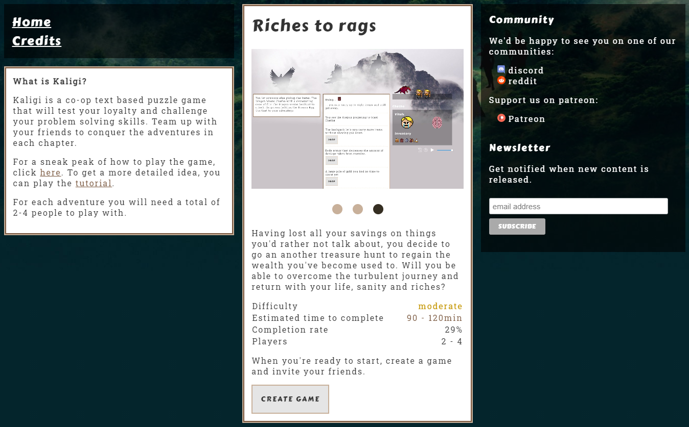
Something else I'm really struggling with at the moment is the landing pages. I'm reusing the game layout for the other pages on the website, including the descriptions about the game. The landing page currently looks like this:
I feel (and some stats seem to confirm this intuition) that the page doesn't do a good job about getting you excited for the game. I have no idea what to do about it.
What's next?
At the moment I'm still not sure. It was a lot of fun going through the process, brainstorming and problem solving. But is the game fun? I don't really know. I've spent so many hours working on the game that it's hard for me to see if it is. The initial response still seems to be interest. Again, time will tell. If you want to try the game for yourself, check it out at kaligi.com.
Thank you for reading
I hope you enjoyed the article and maybe even learned something. If you would like to stay in contact I have a mailing list or you can reach out to me via social media.
